Idea: text-based touch notation

Matt Legend Gemmell:

Touch Notation lets me make gestural-input “cheat sheets” for touch-screen apps just as easily as I can make lists of keyboard shortcuts for desktop apps. The goal is to provide one possible way of talking precisely and accurately (I hesitate to quite say “scientifically”) about touch-screen interaction. I thought it might be of interest to you too, so I’ve decided to share it.

I haven't given this a lot of thought, and don't know if this would be feasible or worth it, but: would it be possible to design a corresponding textual syntax that is both computer-parsable and relatively readable? I would imagine it should look as much as possible as the icon-based syntax. For example, Matt's example of "Swipe right with 2 fingers", which in Touch Notation is

could become "2=>". Or something — I just dashed that off the top of my head. This wouldn't be as expressive as sketching directly on a screenshot to indicate position and direction, but might still be useful.

There could be a Service that lets you select a snippet of text-based Touch Notation and puts the corresponding icons in the clipboard, in your choice of PDF, OmniGraffle format, or whatever. A desktop utility for generating the icons might also be useful. You wouldn't even need the textual syntax for this; you could enter parameters using radio buttons and such.

There could be an iOS app that lets you perform the gestures and then spits out the textual representation. Again, even without a textual notation, such an app could be used to generate the icons, which you could then paste into another iOS app or send to yourself for use on the desktop.

I don't know much about iOS programming — would it be possible to generate useful Objective-C code?

It would be possible to hack Markdown, Textile, or whatever so that text-based Touch Notation would be replaced by icons in the generated HTML. If you use a wiki like Trac or Redmine with a similar markup syntax, you could hack that too.

With a text-based syntax, you could write your design docs and/or user documentation in Markdown if that floats your boat. You could exchange emails about touch UI with people who prefer plain-text email, or who rely on web-based email where it might be hard to insert icons inline. You could jot down quick thoughts in your text-based iOS notes app.

In the comments on Matt's article I see others have also worked on icon-based notations for touch UI gestures. A common textual syntax could be translated into more than one iconic notation.

I'm reminded of dance notation, about which I know nothing but I'm sure similar discussions have been had about it.
App idea: iblint for proofreading menu titles

I got this idea from a discussion of how to capitalize menu items.

Apple's Human Interface Guidelines tell us how to capitalize labels on user interface elements. For example, menu items should be in title case, which Apple calls title style.

From the section "Capitalization of Interface Element Labels and Text" [1] in the chapter on "Text":

Title style means that you capitalize every word except:

  • Articles (a, an, the)
  • Coordinating conjunctions (and, or)
  • Prepositions of four or fewer letters [2], except when the preposition is part of a verb phrase, as in “Starting Up the Computer.” [3]

In title style, always capitalize the first and last word, even if it is an article, a conjunction, or a preposition of four or fewer letters.

Apple gives examples of correctly capitalized menu items [4]:

Save as Draft
Save As…
Log Out [5]
Make Alias
Go To…
Go to Page…
Outgoing Mail

My idea is is for a script and/or app that would scan your nib files and check that you're using the right capitalization style for your menu items. I'd call it "iblint": "ib" as in "Interface Builder", and "lint" as in lint (which is glorifying it somewhat, but maybe the tool could be extended to perform enough checks to merit the link reference). Ideally it would do the right thing internationalization-wise, but just an English version might be a helpful start.

It would be nice if iblint could also check the UI elements that should be in sentence style, but this is trickier. For one thing, a label might contain proper nouns. For another, labels that are not full sentences should use title style, and it might be tricky for a program to figure out what is a full sentence — though on the other hand there are grammar checkers that can spot sentence fragments, so maybe it's feasible.

There might be too many special cases, and it might not be important enough, for this kind of checking to be built into IB, but I think a third-party script that performs a rough sanity check might be useful, if only a teeny bit so. And it might provide a tiny amount of geek fun to run it against all the nibs in my installed apps to see how well they conform to the capitalization guidelines.


Footnotes [6]:

[1] I'd have linked directly to the section, but I've found sometimes links to internal sections of Apple's docs don't work. The link might work for you.

[2] I was glad to come across this, because I'd been wondering whether it should be "Check For Update…" or "Check for Update…". Since "for" has fewer than four letters, I see now it should be the latter.

[3] I agree with the capitalization, but I don't think "Up" is technically a preposition here. I think it's an adverb. But I'm willing to be corrected, and in any case it's obvious what they mean.

[4] They give examples for other UI elements, like push buttons and dialog messages, but not for toolbar items. Presumably the toolbar should use title style, since toolbar items generally correspond to menu items. But I think it's worth saying so explicitly, and I've submitted feedback to that effect.

[5] Notice that "Log Out" is not one word.

[6] Sorry about the flurry of footnotes. I'm too lazy to weave all these side thoughts into something coherent.

Idea: disable Snopes's disabling of text selection

For some reason I don't understand, Snopes.com disables text selection with the mouse. If you try to click and drag, a JavaScript function is called that tells the browser to ignore the click.

As one workaround, you can do "Select All", copy and paste the whole page somewhere, and select whatever excerpt you want from that.

I would like a Safari extension that disables the disabling. Maybe I'll figure out how to write it myself. I wonder if there's a Firefox extension already for this.

App idea: renaming WWDC (and other) videos

As you probably know, Apple has made the 2010 WWDC videos available free via iTunes U.

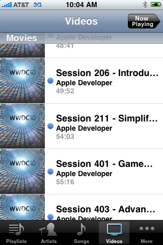
I'm really, really happy about this, and I don't mean to sound ungrateful, but one thing has bugged me about the WWDC videos over the years. When I'm scanning them on my iPhone, it's hard to tell what each video is about because the names all begin with "Session ###", and often a long word like "Introduction".

iPhone video list

I'll check whether iOS 4 handles this better, whether by using a smaller font, wrapping the video name across two lines, allowing the list to be displayed in landscape mode, or whatever. If not, I'll submit an enhancement request.

A workaround might be to write a script that renames all the videos. I wouldn't be surprised if such a script exists already. Things the script could do:

  • remove the word "Session"; maybe replace it with "10-", "09-", etc. for the year of the WWDC, though this would take up a precious three characters and I'm not positive it would be useful
  • remove small words like "a", "to", and "the"
  • shorten "Introduction" to "Intro"
  • shorten other words to 5 letters

I wouldn't want to shorten the long words too much because that would affect searchability using the iTunes search field. Unfortunately iTunes search does not look in the file's Comments field.

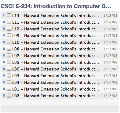
A general tool for shortening names would help with other videos too. Here's how iTunes displays a list of videos to sync to my iDevice. There's no way for me to see the full name:

iTunes-video-list.png

UPDATE: I filed rdar://8122296. You can see it on Open Radar here.