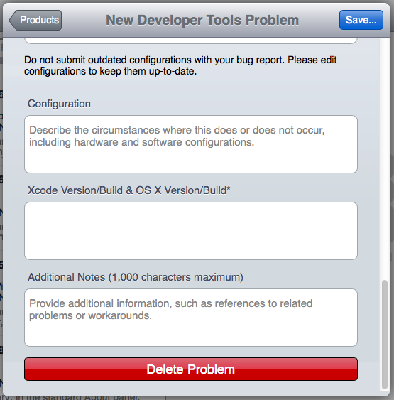
UI rule of thumb: use the biggest buttons for the most likely actions.
UI rule of thumb: Convey a sense of progression by putting a sequence of steps in a row or column, one after another.
Corollary to that second rule of thumb: Having led the user through a list of actions, don't make the last thing on the list "Cancel everything I just did", because that is very likely not what they want.
Pop quiz: How many of the above rules of thumb does Radar break here?
Extra credit: Did you think to yourself, "On iOS it's normal for the 'Done' button to be at the top right corner, so this makes perfect sense"? Or did you think to yourself, "This is not iOS"?

UPDATE 2014-09-09: Great news from Zach Drayer:
Not covered in the Keynote, but still big: RadarWeb got rid of the big “Delete Problem†button at the bottom: http://t.co/mT1eYMShAT
— Zachary Drayer (@zadr) September 9, 2014