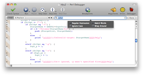
Recently, Xcode departed from the traditional Mac UI for finding a string in the document you are looking at. When you do a Find, Xcode now adds a "find banner" within the document window instead of opening a separate Find panel. The find banner contains a search field and a few controls for specifying the kind of search you want to do. Search is performed incrementally, and matching results are highlighted as you type in the search field.
I'm not crazy about this change and I'm not sure I get the reasoning. I assume one reason for the in-window approach is that a separate Find panel might sometimes appear over your document window, which would get in the way of your seeing the results of the incremental search. But the new approach always removes some of the text you were looking at, and to minimize this loss it's forced to cramp too many controls into a narrow strip.
Mark Alldritt suggests a variation that uses a popover to mitigate the screen real estate problem:

I think this improves on the Xcode implementation, especially if the tab key behaves as I think it should. Currently in Xcode, when you tab out of the search field, focus returns to the main text area and you can resume editing your document. With Mark's popover approach, I would want all the controls in the popover and the find banner to be combined into one big tab loop. You'd hit Escape to resume editing.
The other thing I would want is a single mode for both Find and Find & Replace. It really irks me that the Xcode implementation has different modes for the two operations, because I'm so used to hitting Command-F and being able to do either one.
Besides messing with my muscle memory, Xcode's implementation is keyboard-unfriendly. With the old-school Find panel, I could enter my search text and either hit Return for a simple find, or tab to the Replace All button, which is the kind of replace I usually want to do. In Xcode, I have to use a popup menu to choose Find & Replace mode and I have to use the mouse to click "Replace All", because I can't tab to those buttons.
As a partial workaround, I've assigned Command-Control-F to Find & Replace, which relieves me of having to click the popup, but that's a pain because I have to remember to hit it instead of Command-F like I've done in every other Mac application for decades. For a while I had Command-F as the shortcut for Find & Replace, but since the Xcode documentation window uses the same shortcuts, and it doesn't have Find & Replace, I had to remember to hit the right shortcut for Find when I was in that window. Either way leads to annoyances.
Frankly, what I really want is the traditional Find panel back. It does the right thing in terms of respecting your screen real estate: if it finds a match, it goes away and you are back in your document, ready to edit; if it does not find a match, it selects the whole search field so you can edit it and try again.
I think the Find panel could be modified to support incremental search. It could be translucent so you can see your document underneath it. I usually place it in an out-of-the-way corner of the screen anyway, though granted this is easier on a big screen than on my 11" MBA.
Or maybe the Find panel could do its old non-incremental search, totally the way it used to, and for incremental search (invoked with a different keyboard shortcut) you could get a hovering translucent text field that does case-insensitive plain-text search and nothing else, no options. I wouldn't mind if Xcode came with a preference to apply the incremental search to the symbols in the function popup, perhaps with the kind of fuzzy searching used in PeepOpen, except applied to function names within a file instead of file names.
(Disclaimer: I have not used PeepOpen, only seen its web site.)
(P.S.: I just submitted Radar 8839524 asking for the old Find panel back.)
You want to check Xcode Single File Find: https://github.com/0xced/XcodeSFF
That's exactly what you want, i.e. the traditional find panel back.
Thanks — I'll take a look.
Pingback: Michael Tsai - Blog - A Better Text Find & Replace User Interface